
01/10/17
First, I’ll provide some context on what conversion means to us, why is a landing page so important to drive conversions, which other sources contribute to conversions.Second, I’ll take give a walkthrough of what our old page looked like. What people were struggling with and what was not working. How not only did we fixed those issues with 5 changes but rather doubled our conversion.
What does conversion mean for us?
When it comes to growth, at UrbanClap one of the primary metrics that we track is number of people visiting our website or app and placing a request. This is conversion for us.For the purpose of this post, I’m limiting this to our SEM web landing pages. These pages are different from our SEO landing pages.
For example, if you search for Best Interior Designers in New Delhi — you’re very likely to receive results on google like shown below:
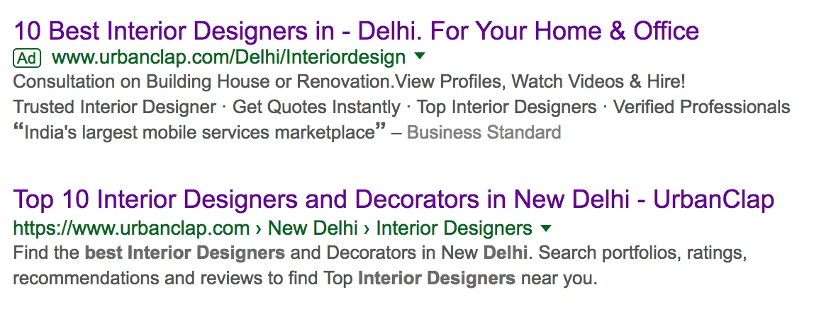
The page one on top is an Ad that we run on certain categories to boost our search engine results visibility. The page at the bottom (without the Ad tag) is the one that Google ranks organically. While designing for the ‘Ad’ page, we have one primary focus — Convert the user unlike the one at the bottom where we need to put in a lot of content, and cross-linking and different kinds of relevant data for Google to understand and index. Which means, that not everything that we put on a normal SEO landing page helps a user convert.
P.S.: We also keep running a lot of experiments by running an ad on our SEO page as well.To simplify: SEM Page should have just one focus — Convert the user. SEO page should have both — make it usable for Google + make the user convert.
Our old page and 5 changes we did to double the conversion
This is the old page that we had been running for Interior Designers. As you can see, this had quite a few problems:

Upon landing on this page, it’d basically just do a sales pitch and ask me to hire an Interior Designer — ‘Hire Now’.
The user just landed on the page and we expected her to be ready to place a request.That followed with just 4 examples of images of different rooms. At this point, the user does not know what’s happening on this platform — is UrbanClap an Interior Designing Studio? Why doesn’t it have more images or work to showcase? Is it an agency that has an exposed contact form after which they’ll contact me with a custom quote?The testimonials were not very easy to read and seem very generic to what all platforms might have to sell.
One could not click and check the profiles of the designers that I have showcased here. Why does every profile have a different number of customers? Wasn’t UrbanClap a studio?And then why’s there a ‘Download the app’ here? Moments ago, we were trying to have her hire an interior designer and now I want her to download the app.
All of these combined (and a few more that I’ll cover next) did more harm than good to the user. A user would leave our platform more confused and it hampered our conversions — only a very few people out of all who landed would end up placing a request.
After spending quite some amount of time observing how users were actually using our page (we regularly use Inspectlet videos to understand user behaviour on our pages) and validating the issues highlighted above, there were 5 things that were outlined as fixes and doubled our conversions:
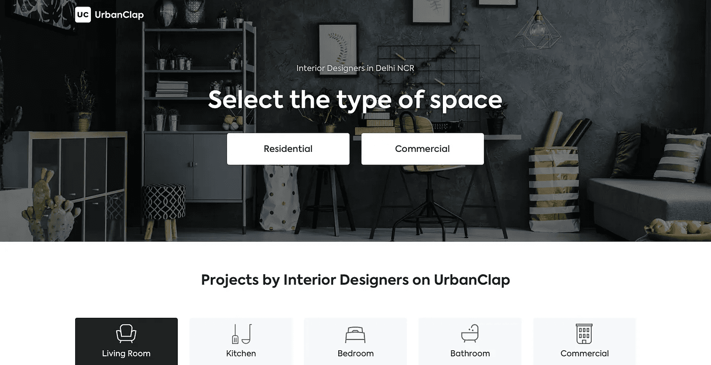
1. Help the user move forward
It was only natural to ask the user to choose what she had in mind in her search journey of finding best Interior Designers in Delhi NCR. Instead of repeating the search query and keeping a Hire Now button, it made sense to help her move forward as soon as possible with the next obvious question — Select the type of space you’d want to get designed (in this case).
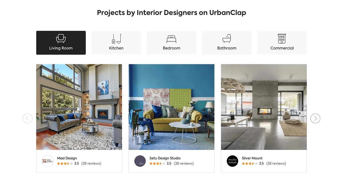
2. Show useful work of professionals on the platform
To build confidence and trust, we wanted to present ourselves as a platform that knows and will help you the right Interior Designer. We moved from just showing 4 images (before) to a section showing multiple work photos by our Professionals categorised by spaces/ rooms (Living Room, Kitchen etc.) to make browsing easier.
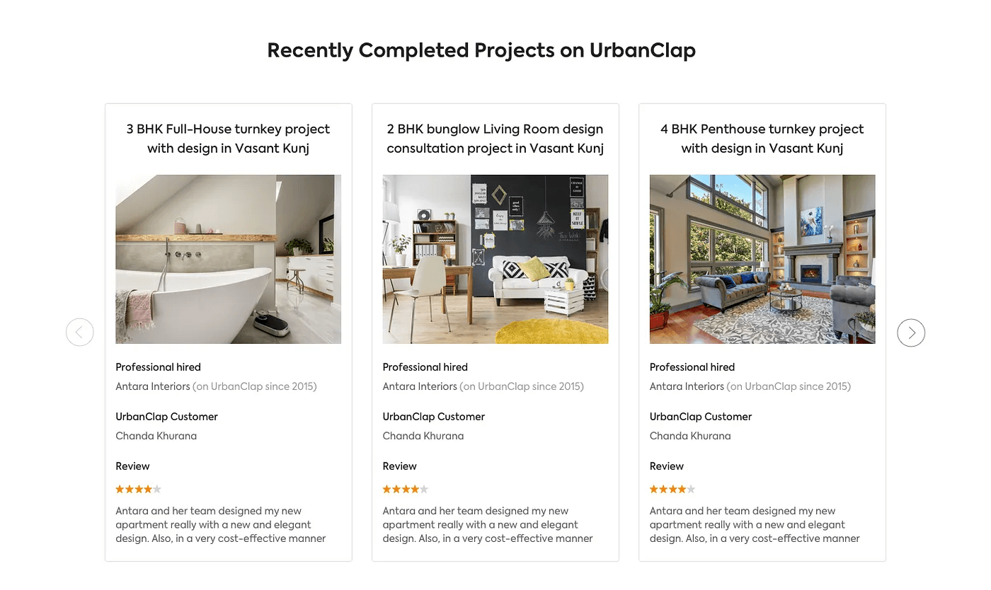
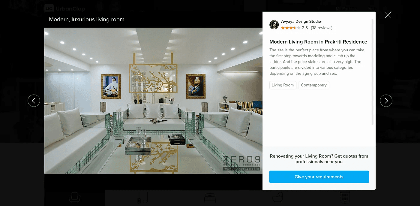
3. Instead of showing testimonials, we displayed recently delivered projects with reviews
We wanted to show what we were selling than just tell. Putting the exact project requirement by a real user and real photos of work done by a professional on UrbanClap along with the customer’s review is more powerful than just a blurb of text (as we had used before)
4. Progressively disclose information
While keeping the user engaged on the page, it’s very important to plug our conversion CTA as well in the browsing experience. Users tend to click on big image thumbnails and expect a larger version. In the page, when one would click on a project to see other images of the same home re-design, we would take that opportunity to talk more about that project and at the same time have a Call to Action to take next steps as well.
In our case, a Call to Action would always open a questionnaire to place a request.
5. Re-designed for trust
Hiring an Interior Designer is a huge financial as well as mental investment. You would not hire one from a website that did not look good to begin with. The visual design of the page needed a heavy uplift for this very purpose. We fixed the typography, layout, grids, white space and overall look and feel of the page to make it look more professional and a platform that you could trust.

Few other learnings that we had along the way that you might find beneficial as well:
The fold matters — you’d want to keep your primary call to action(s) and most important section of information around the hero area. There are tons of articles debating around this notion but in practice, we have seen it work.
Remove all links that take the user away from the current page. Since it is an ad targeted page and not one to satisfy Google, your objective should be to converge the attention of the user to anything and everything around the call to action.
Continuously test these pages for performance. After observing user behaviour on the new pages, we found them interacting the least with text heavy sections. We are experimenting with making them as visual as possible.
Do not try to tell the user how your platform works on the first go. They can be on-boarded further down in the funnel. You want them to find the closest thing useful and move forward.
Other posts in
Product & design
14/12/24
11/12/24
02/12/24
31/10/24
29/10/24
28/10/24
11/10/24
05/10/24