07/11/13
I’ve always admired people who have taken on short term side projects across the domains of development, design and I was curious if I could start to cultivate the discipline needed to get started and keep going on the likes of this.
I love reading books. I’ve got more books in my wardrobe than anything else in it (clothes, toys, papers included) and being a net dependent ho, I extensively make use of my Goodreads account to discover new books and get recommendations, which by the way are really good on Goodreads, and buy/ read them. But, no matter how good the engine is, Goodreads is one of the sites that is way distant from the product it is about. I find it quite surprising that it’s still surviving off a design that has already overstayed its welcome 5 years ago.
I listed a couple of problems that I, as an average user, find with the site and started.
Before I started with this project, my personal brief wasn’t “Redesign Goodreads”. It was “Redesign the way you discover books online.”
Setting clear expectations before beginning with the project was very vital for a correct, meaningful approach.
There are a few things that I wanted to solve right away:
Remove clutter from the Goodreads landing page
Remove unnecessary content blocks that made sense back in the days but not anymore. Users are getting educated on the expectations and behaviour of what should be presented and to be interacted with. We simply cannot push them to read/ absorb everything.
Make recommendations the primary pillar for the website.
Make Search more meaningful.
Make focus of the website crystal clear. Books.
Make activity feed page more structured and personal.
Have distinct visual separations for different kinds of activities on the website.
While these were the things I personally wanted to solve for myself, I also had to keep in mind what if a similar design was to go live for 20+ Million users? Would they be able to digest the drastic transition? How will they get stuff done considering how they used to before? What are possible areas users will stumble upon?
And, with that, I’ve created a concept design for Goodreads. Here it is.

A decluttered header and site message.

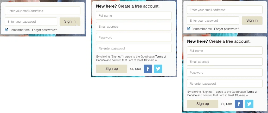
Better Login/ Sign up forms

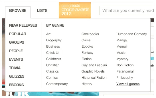
Put everything required in a proper, cleaner header

Search that actually makes sense

The point is pretty clear. You’re on Goodreads for a couple of reasons. For the sake of this re-design, let’s just focus on searching for books. If it’s just strictly books that you’re searching for, it’s most likely that you already know about the book or you own it. In that case, I’d be highly interested in looking at some recommendations as well.
Discover new books just as easily. Right on your home page.
The new tooltip hovers are pretty straight forward.
Books: The title, author(s) name, Description brief, Rating, very simplified buttons to add the book to your list and finally followed by a button to go to the book detail page. Very simple.
Authors: Author name, bio, recent books (very helpful in recognition and other books’ discovery) followed by a link to the author’s page.

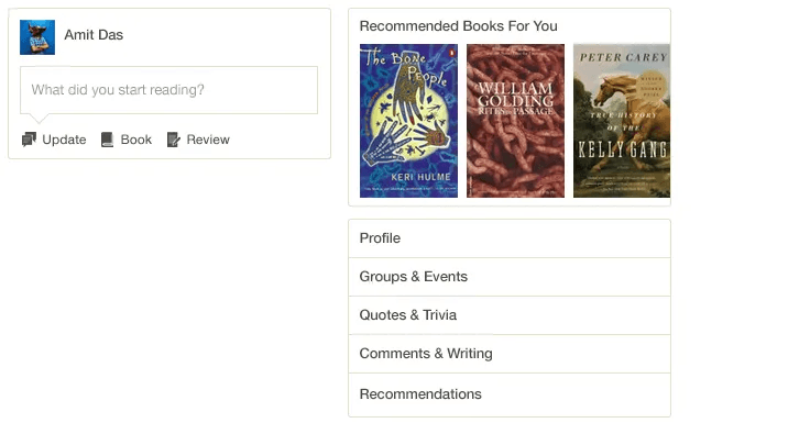
Feed Page Basics — The Interaction and links

Different types of activity posts

Full frames


That's it! Thank you.
Other posts in
Designers
09/01/25
10/12/24
01/12/24
18/10/24
12/10/24
09/10/24
04/10/24
19/07/24
