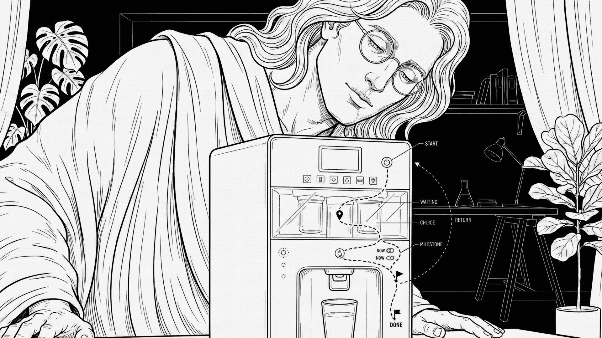
You turn on a new water purifier for the first time. Lights blink. The motor makes a sound. Water does not come out. You wait. Nothing changes. You don’t know if it is working, stuck, or broken. You press the button again. Now you are worried you made it worse. You're actually worried because you don’t know where you are.
Now think about a modern TV remote. It has many buttons. Home. Back. Menu. Input. Settings. Voice. Some buttons open full screens. Some open small bars. Some do nothing unless the TV is in the “right” mode. You press Back and sometimes it goes back, sometimes it exits, sometimes it closes the app. The buttons are seemingly clear to you but you are confused about where you are inside the TV. The remote is fine and the TV works. But the path is missing.
Both problems come from the same place. People do not understand products as lists of steps. They understand them as movement. In daily life we say things like “I’m getting started,” “I’m halfway there,” “I’m stuck,” or “I finally reached the end.” These are how our mind works. We think through metaphors like journeys, paths, and places. We understand action as moving forward, trouble as being blocked, and success as reaching a goal.
It's easy to ignore this in hardware design. We write them with ideal use case scenarios and we think in commands. Commands like 'Press this,''Wait,' or 'Done'. But the user is already using a journey idea in their head. When the product does not show movement, the user feels lost. Silence from the machine feels like standing still on a road with no signs. A blinking light on the product with no meaning feels like being in the dark. Think about how we talk about arguments like war. We attack, defend, win, or lose. This way of thinking pushes people into fight mode. The same thing happens with machines. When errors are shown as “failed,” “invalid,” or “denied,” the product feels like an enemy. The user feels blamed and the otherwise well-intended user journey stops and turns into a fight.
Think again about the TV remote. A good path would make it clear when you are inside an app, when you are at the TV level, and when you are changing system settings. Back would always mean “go one step back on the path.” Home would always mean “return to the start.” Today, these meanings change based on the OTT app and button behaviour within their app context. That breaks the journey in the user’s head.
Waiting is another place where products fail. We usually treat time like money. We say, 'Time is money.' We say time is spent, saved, or wasted. When a machine asks you to wait with no sign of progress, it feels like loss. People unplug routers, cancel updates, or press buttons again because it feels like time is being taken away. If waiting were shown as distance being covered, people would wait longer without stress.
Lights and sounds in a product matter heavily because of simple body rules. More is up, good is up, active is up are baked into how we read signals. Up feels good. Down feels bad. Moving feels alive. Still feels wrong. These ideas come from how our bodies work and how culture grows around them. A light that slowly moves or grows tells the user they are going forward. A dead or sharp red light tells them they are blocked.
Choices are where trust is lost. Every product has choices, even if designers hide them. Think washing machines with 12 programs without explaining which one fits their 'daily clothes.' Even TV software updates with no idea how long it takes. Auto or manual. Now or later. Continue or stop. When choices are hidden, users feel tricked. A real path shows the split and explains it. It also shows how to come back if the choice was wrong.
The most important part of a path is return. In real life, roads always show how to get back. Google Maps will silently reroute you while you're still driving. Machines rarely do. Errors often drop users into a dead end. A good path never does this. Even when something goes wrong, it shows the next step forward.
If you cannot draw the path of your product on paper, the product is unclear. If you cannot mark the start, the middle, the choices, and the end, users will feel lost. If the path isn’t clear to the designer, it won’t be clear to the user.
Start by asking simple questions and you'll be off to a good start: Are all choices clearly shown as choices? Can the user tell where they are without reading text? Are lights and sounds tied to progress or state? Can a first-time user recover without help? Are service and setup paths as clear as daily use paths? Can a non-designer explain the path after one use? Are all choices clearly shown as choices? Is progress visible at all times?
